Nuxt Blog
A developer blog with custom SCSS architecture and editorial design — built with Nuxt 3 and Payload CMS.
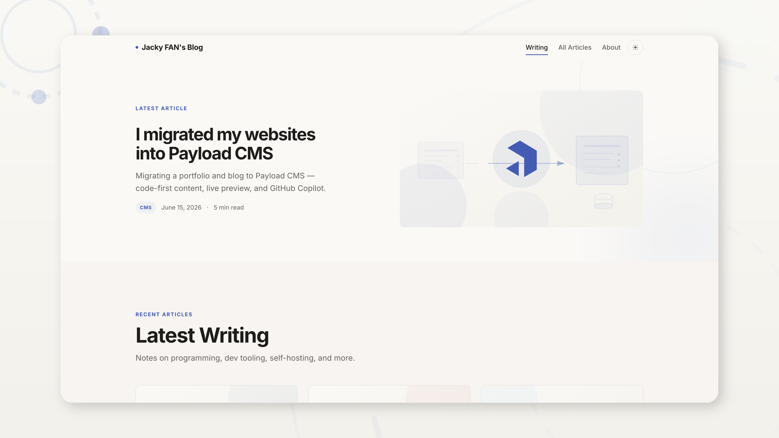
An editorial blog built from scratch
A developer blog with a custom SCSS design system, CMS-driven content, and attention to every typographic detail.
Built with Nuxt 3 and Payload CMS, this blog was revamped with a custom SCSS architecture — 13 modular partials covering tokens, layout, typography, components, and responsive breakpoints. The editorial design uses a warm palette with Inter for body text and JetBrains Mono for code.
Content is managed through Payload CMS with live preview, draft/publish workflow, and automatic cache revalidation. Articles support rich text with inline images, code blocks with syntax highlighting via highlight.js, and a copy-to-clipboard button. Locomotive Scroll v5 provides smooth parallax scrolling throughout.
The reading experience is polished: RSS feed for subscribers, dark mode with carefully tuned contrast ratios, and a full-screen mobile menu with staggered animations. Images open in a custom lightbox with spring-animated transitions.
A tour of the blog
From the homepage to article detail — every page designed for a great reading experience.
What makes it shine
Every detail designed for a great reading and writing experience.
Custom SCSS Architecture
13 modular partials with CSS custom properties for design tokens. Warm editorial palette with Inter for body and JetBrains Mono for code.
Dark Mode
System-preference-aware dark mode with manual toggle. Every color variable re-mapped for comfortable nighttime reading — meets WCAG contrast requirements.
Rich Content Editing
Payload CMS with live preview, draft/publish workflow, inline images, and code blocks with syntax highlighting and copy-to-clipboard.
Image Lightbox
Inline images open in a full-screen modal with spring-animated transitions, backdrop blur, and keyboard navigation — smooth on every device.
RSS + SEO
Auto-generated RSS feed with full article content. Dynamic sitemap, Open Graph meta tags, and semantic HTML for search engine visibility.
Responsive Design
Adaptive grid layouts from 3-column desktop to single-column mobile. Full-screen hamburger menu with staggered animations at tablet and below.
Built with
A modern stack chosen for performance, developer experience, and longevity.
 Nuxt 3
 TypeScript
 Tailwind CSS
 daisyUI
 SCSS (BEM)
 Payload CMS
 Docker
Want to see more?
Read the latest posts about frontend development, self-hosting, and more — or browse the full project gallery.